Fusedash
Fusedash unifies AI visualization and reporting to turn data into actionable insights faster than competitors.
About Fusedash
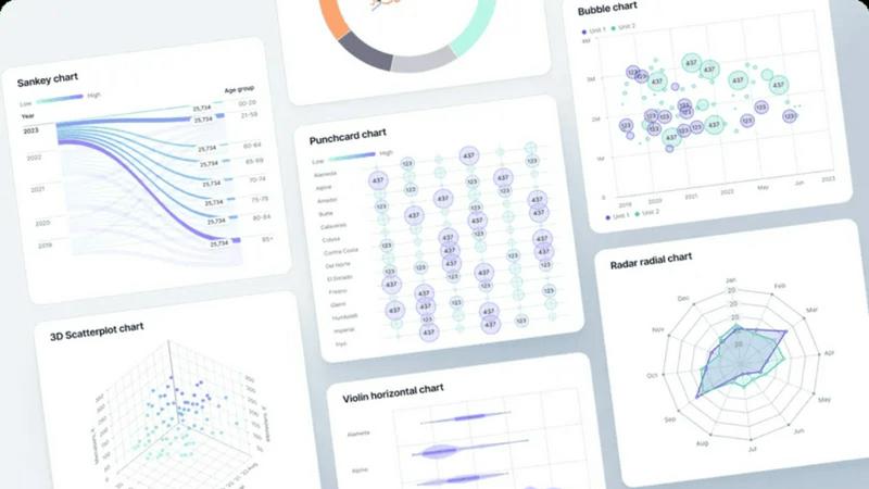
Fusedash is the AI-powered data visualization platform built for teams that are tired of fragmented, inconsistent, and slow reporting. While other tools force you to rebuild the same logic across dashboards, spreadsheets, and slide decks, Fusedash delivers a unified workspace where data becomes decision-ready insight. It's engineered for data-savvy teams in marketing, revenue operations, leadership, and beyond who need to move from raw numbers to actionable understanding at the speed of business. Connect your data once from CSVs or APIs, define your core KPIs, and then deploy them across interactive dashboards, AI-generated charts, detailed maps, and narrative reports. The platform's battle-tested differentiator is consistency: reuse metric definitions everywhere to eliminate version conflicts and ensure every stakeholder, from analysts to executives, is looking at the same truth. With integrated AI chat for natural language exploration and real-time interfaces for mission-critical monitoring, Fusedash doesn't just visualize data—it operationalizes it, turning insight into impact faster than the competition.
Features of Fusedash
Unified AI Visualization Workspace
Fusedash consolidates every visualization need into a single, powerful environment. Ditch the tab-hopping between a basic chart builder, a separate dashboard tool, and a presentation deck. Here, you build from a connected dataset once, then pivot seamlessly between creating interactive dashboards, standalone AI-generated charts, geographic map analyses, and contextual narrative reports. This unified approach eliminates redundant work and ensures visual and metric consistency across every output, giving your team a single source of insight.
AI Chart Generator & Data Chat
Go from question to visualization in seconds, not hours. Start by asking questions about your data in plain language using the integrated AI chat. Get instant summaries, breakdowns, and metric suggestions. Then, use the AI chart generator to transform your CSV or API data into publication-ready charts with intelligent chart-type recommendations, automatic comparisons, and clear labeling. It's the fastest way to explore data and create compelling visuals, whether for deep analysis or a stakeholder update.
Consistent KPI Definitions & Reusable Logic
Stop rebuilding calculations in every new report. Fusedash lets you define core metrics, dimensions, and time comparisons centrally. Once established, these battle-tested definitions are reused across all dashboards, charts, and reports. This ensures that "Revenue," "Active Users," or "Conversion Rate" means the same thing on the leadership dashboard as it does in the marketing report, building unparalleled trust in your data and ending debates over conflicting numbers.
Real-Time Monitoring & Interactive Storytelling
Monitor fast-moving metrics on live interfaces when every minute counts, perfect for operations or campaign tracking. For deeper context, combine those live views with Fusedash's storytelling features. Embed charts and KPIs directly into narrative reports to explain what changed, why it matters, and what the next steps are. This fusion of real-time data and narrative context turns static dashboards into dynamic tools for alignment and action.
Use Cases of Fusedash
Executive KPI Review Dashboards
Provide leadership with a single, authoritative view of company performance. Consolidate financial, operational, and growth metrics into a clean, filterable dashboard. Reuse certified KPI definitions so executives can drill down from a high-level summary into regional or product-line performance with confidence, knowing the numbers are consistent and always up-to-date, eliminating the weekly "data reconciliation" meeting.
Marketing & Revenue Performance Tracking
Unify campaign data from multiple sources to track ROI, pipeline velocity, and channel effectiveness in one dashboard. Use AI chat to quickly segment performance by campaign, region, or time period. Generate on-the-fly charts for stakeholder reviews and create narrative reports that link spend to outcomes, proving marketing's impact on revenue with clear, consistent data stories.
Operations & Logistics Monitoring
Deploy real-time interface dashboards to monitor fast-moving operational metrics like shipment status, support ticket volume, or system uptime. Combine this with map visualizations to track geographic distribution and pinpoint bottlenecks. Set up alerts and use consistent logic to ensure every team is responding to the same live data, enabling swift, coordinated action.
Geo-Analysis with Map Visualizations
Transform location-based data into immediate insight. Whether analyzing sales territories, customer density, or campaign performance by region, Fusedash's native map visualizations make geographic trends clear. Overlay your KPIs on interactive maps, filter by region, and drill down to understand spatial drivers of performance, all within the same platform used for your other dashboards.
Frequently Asked Questions
How does Fusedash ensure data consistency across teams?
Fusedash tackles the root cause of inconsistent reporting: scattered logic. You define key metrics, calculations, and segments centrally in the platform. Once defined, these "single sources of truth" are reused in every dashboard, chart, and report you create. This means a KPI on the sales dashboard is calculated identically to the same KPI on the finance report, eliminating version conflicts and building universal data trust.
Can I use Fusedash for real-time data monitoring?
Absolutely. Unlike tools built only for historical reporting, Fusedash includes powerful real-time interface capabilities. Connect to live API feeds or databases to monitor fast-moving metrics—like website traffic, production line status, or ad spend—on dynamically updating dashboards. This is essential for operations, DevOps, and marketing teams where conditions change minute-by-minute and swift action is critical.
What makes Fusedash's AI different from other analytics tools?
Fusedash's AI is deeply integrated into the entire workflow, not just a bolt-on chatbot. It starts with Smart Chat, allowing you to explore data conversationally. But it goes further by directly powering the chart generator to suggest and create optimal visualizations, and it assists in refining entire dashboard views. It's a collaborative AI built to accelerate the journey from question to shareable, production-ready insight.
What data sources can I connect to Fusedash?
Fusedash is built for flexibility. You can start instantly by uploading CSV or Excel files. For ongoing automation, connect directly to numerous business APIs, databases, and data warehouses. The platform allows you to blend these datasets together to create unified views, enriching your internal data with public datasets when geographic or market context is needed, all within one cohesive workspace.
Explore more in this category:
Top Alternatives to Fusedash
Subiq
Subiq is your go-to solution for managing SaaS subscriptions, cutting unnecessary costs, and preventing wasted spend before renewals hit.
Bulker
Bulker delivers instant AI-driven user insights without interviews, transforming questions into actionable reports in seconds.

OGTV
OGTV is the ultimate Omegle alternative for genuine connections, offering fast, free, and secure 1v1 video and text chats worldwide.
Yevideo - AI Video & Image Creation Platform
Yevideo crushes the competition by turning your ideas into stunning, studio-quality AI videos and images with unmatched control and speed.
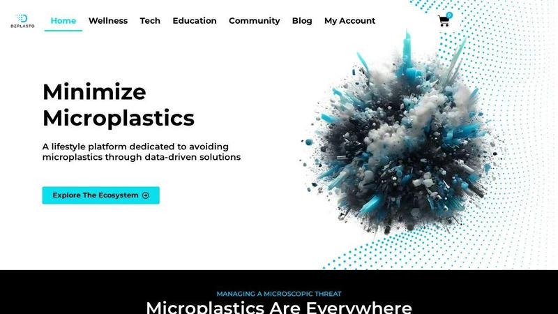
Microplastic Intake App
Outsmart the invisible threat with the only app that tracks and minimizes your daily microplastic intake.
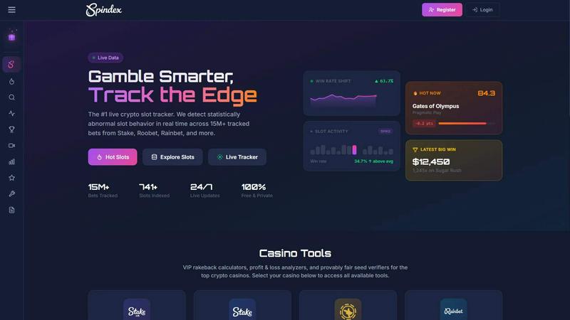
Spindex
Spindex empowers players to gamble smarter by tracking real-time slot performance and identifying winning patterns across top crypto casinos.
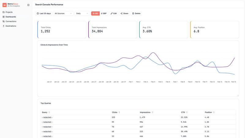
Metric Nexus
Metric Nexus is the AI marketing analytics platform that gives you instant answers about your ad performance in plain English.
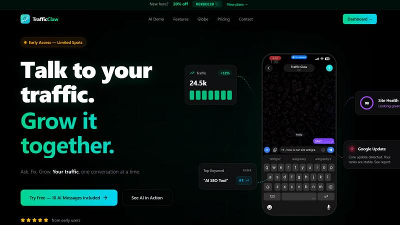
TrafficClaw
TrafficClaw transforms your SEO and analytics data into actionable insights through intuitive conversations, driving your traffic growth effortlessly.